 myCSUSM


Creating Accessible Powerpoint Documents
Using Microsoft PowerPoint is an easy and effective way to present information for a lecture in a class. However, there are steps that need to taken to ensure students with visual impairments and those who rely on assistive technology can access the material.
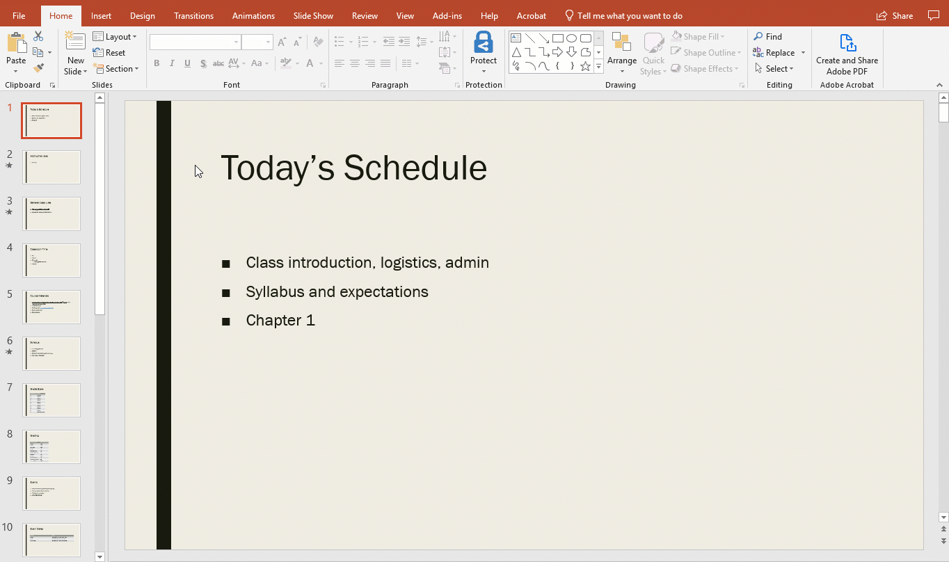
Use PowerPoint’s Built In Templates
PowerPoint has built in slide templates that allow the user to have slide titles which helps screen reader users navigate through a presentation. To make sure a slide has a proper template right click on the slide and select Layout.
Avoid Insufficient Color Contrast
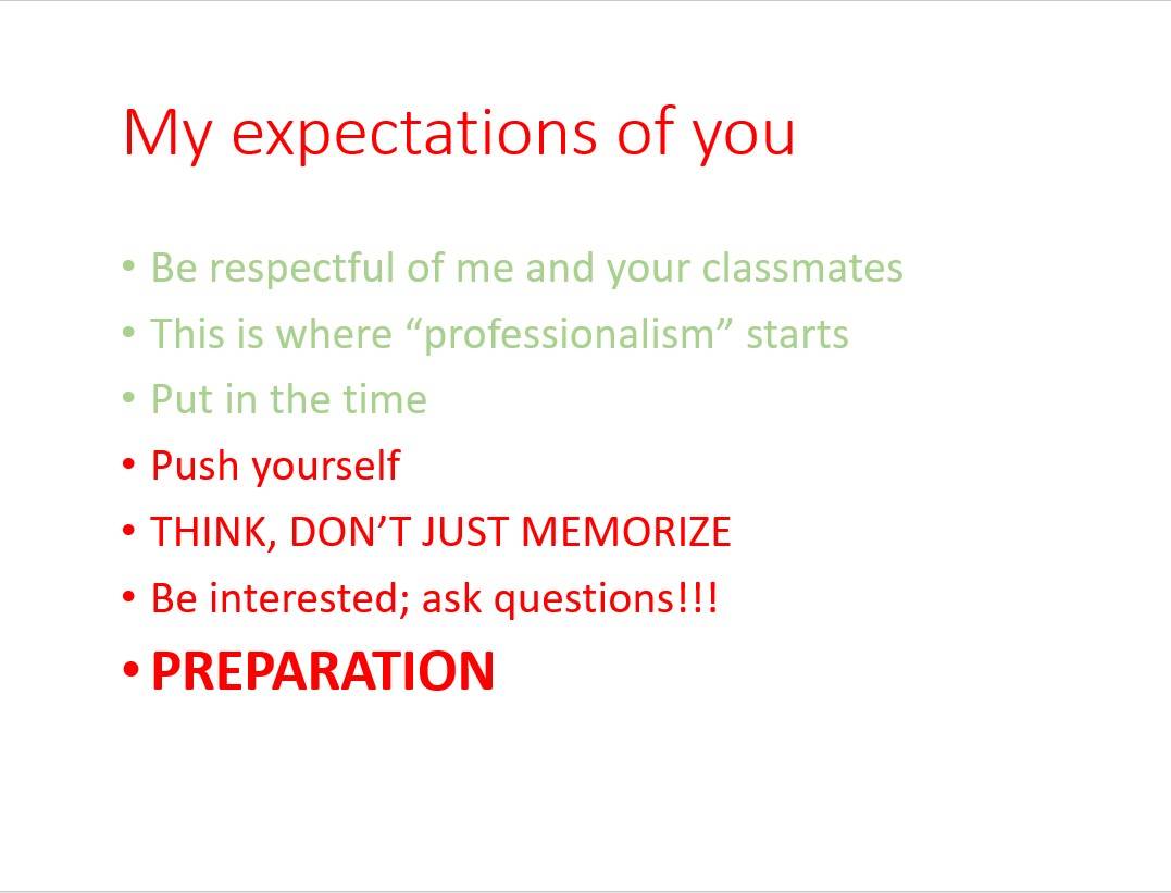
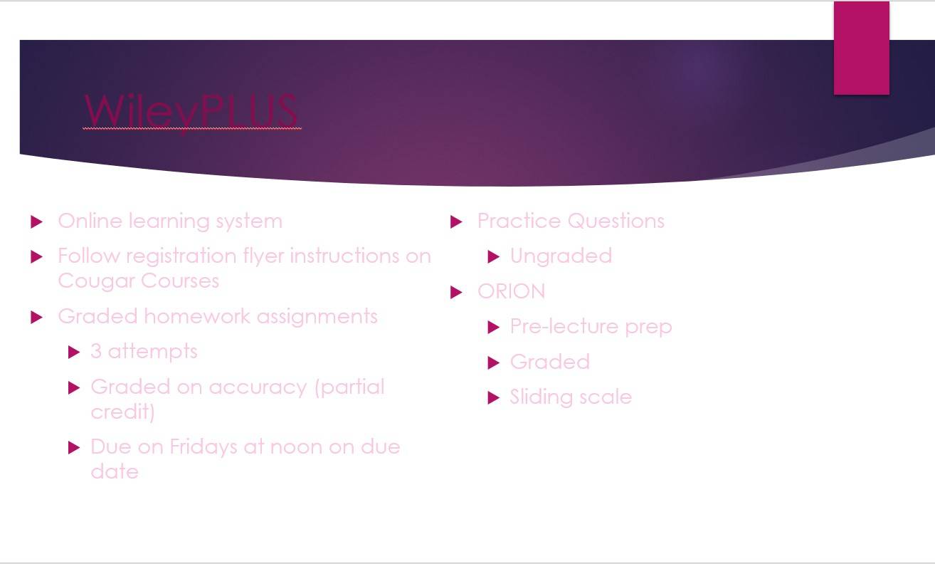
Having insufficient color contrast in a PowerPoint means that it contains text that may not be legible. This mainly includes having light colored text on a light-colored background or vice versa. Insufficient color contrast also applies to having a lot text that is green or red because color blindness is a fairly common visual disability.
- Examples of slides with insufficient contrast
Red/Green Insufficient Contrast
- It is not recommeded to use a lot of red and green colored text
Poor Text and Background Contrast
- Avoid using font colors that do not stand out/contrast well with the background. This example shows dark pink text in front of a purple background and pink font in front of a white background
Grey Insufficient Contrast
- Avoid using grey fonts and colors as much as possible, they could could be hard to view by some students
- Text Contrast Tips
Follow these recommended tips to improve text readability in a presentation:
- Use fonts with wide character strokes.
- Use a font size of at least 12px. If using a font with thin character strokes, use at least 16px.
- Check color combinations before finalizing your design with the WebAim Contrast Checker. Color's used in campus content legally must be a 4.5:1 ratio or higher.
For more on color contrast in documents visit Blackboard’s Text Contrast Page.
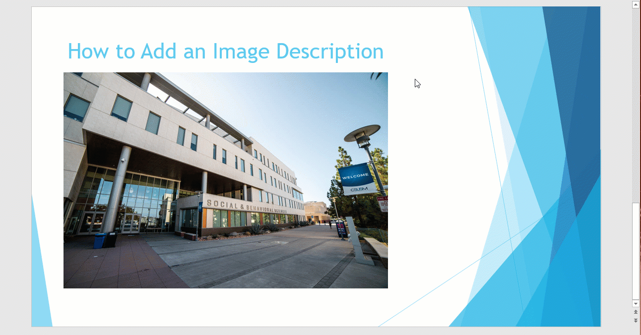
Use Alternative Text Descriptions
Alternative text, or “alt text” describes the content of images, graphs and charts for Screen readers and Braille devices. The descriptions should be 1 or 2 meaningful sentences that best describe the image to someone who cannot see it. Adding alt text to an image in Word is fast and easy.
- How to add alt. text to an image (with clip)
- Add the image to powerpoint.
- Right click on the image
- Select "Edit Alt Text" and type the description in the box provided.
If the image is for decorative purposes only and does not require an alt text, simply check the "Mark as Decorative" box.
Avoid Using Images of Text
While images of text might make slides easier to create , especially when it comes to complex scientific or math equations, they are not readable for users who rely on assistive technology.
Avoid using images of text in any capacity within a slide whenever possible. If an image of text must be added to a slide, then be sure to add in alternative text to that image so all users can consume that information!
- Example of an image that could pose accessibility issues
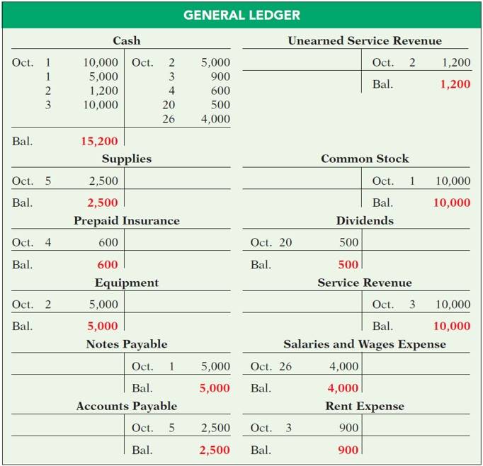
This photo contains a lot of text that may be too much to insert into an image description. It may be much more accessible to include the text in the actual document.
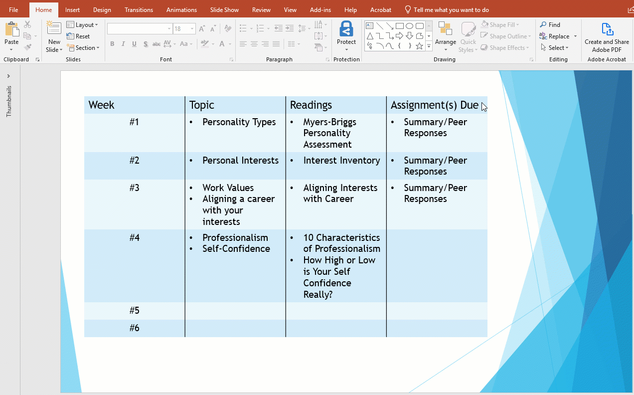
Make Accessible Tables
Tables are very useful to organize data in a document. However, not taking the proper steps to making a table accessible will make it very hard for screen reader and braille users to understand the data. Tables should only be used when absolutely necessary in organizing data and should avoid being used for decorative purposes.
- How to make an accessible table (with clip)
- Create a table.
- Highlight the top row of the table.
- Click Table Design located at the top ribbon.
- Check mark the Header Row box at the top left of the page.
Making the top row a header row will allow for screen readers to recognize data more efficiently.
Accessible Hyperlinks
Adding links in a document is a great way to provide sources of additional information. However, using an entire URL link is not an accessible method. Using the hyperlink in Microsoft Powerpoint is a much more accessible method.
- How to make an accessible hyperlink
- Type out a phrase that will open into a new page. This should be a phrase that is stand alone and is not a generic phrase like "Click Here".
- Highlight and Right click on link phrase. A popup dialog box will appear.
- Paste the URL in the “Address” box.
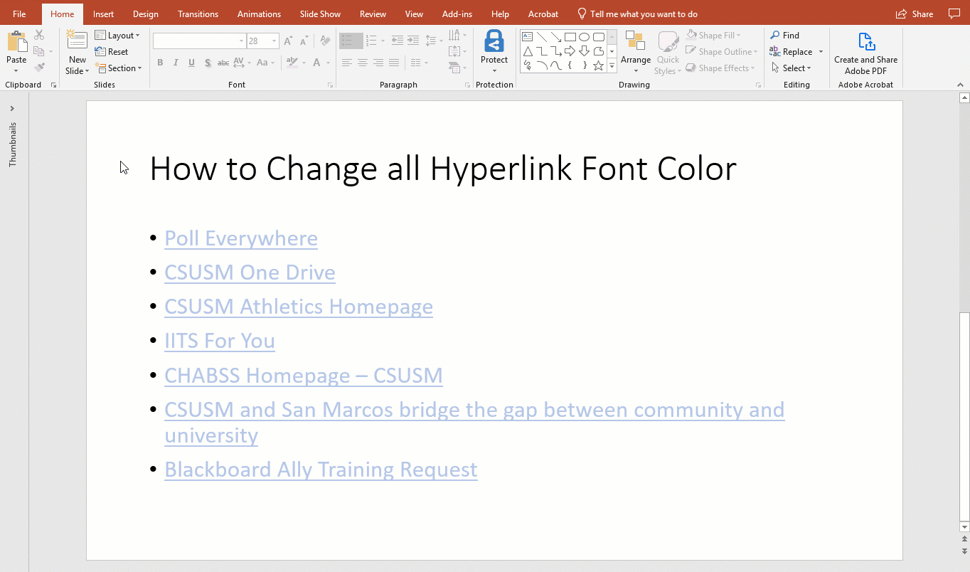
- How to change hyperlink text color (with clip)
Whenever a hyperlink is created, the color of the text will automatically change depending on the presentation's design layout. Sometimes that color may contain insufficient contrast that could pose an issue for some students. The video below shows how to automatically change the color of all hyperlinks in a presentation.
- Go to the "Design" tab at the top.
- Click on the drop down menu under Variants on the right side of the page.
- Select Colors and Customize Colors.
- Change the font color for hyperlinks to increase its contrast.
Use PowerPoint's Accessibility Checker
Microsoft products have a built-in accessibility checker which can help the document creator test the overall accessibility of the document. The checker provides: Inspection Results, feedback about the importance of each item, and tips on how to repair issues.
Access the Accessibility Checker
- Select File from the top tab.
- In the sidebar select Info.
- In the content area, select Check for Issues.
- In the fly-out menu select Check Accessibility.