 myCSUSM
Creating an Accessible Newsletter
General Guidelines
- Do not post fliers or images with text in them to your newsletter
- Make sure links posted have descriptive clickable text
- Choose good color contrast
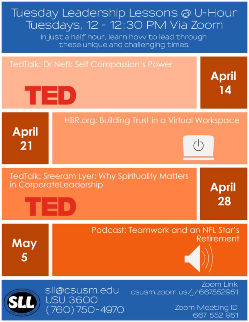
Avoid posting images with text and/or fliers in them.
Inaccessible Flyer

Accessible Content
Instead type the content out manually with headings if possible:
Tuesday Leadership Lessons at U-Hour
Tuesdays, 12 - 12:30 PM via Zoom
In just a half hour, learn how to lead through these unique and challenging times.
-
-
- April 14: TedTalk: Dr. Neff: Self Compassion's Power
- April 21: HBR.org: Building Trust in a Virtual Workspace
- April 28: TedTalk: Sreeram Lyer: Why Spirituality Matters in Corporate Leadership
- May 5: Podcast: Teamwork and a NFL Star's Retirement
-
Zoomlink: csusm.zoom.us/j/########
Zoom Meeting ID: ### ### ###
Clickable links should contain a descriptive phrase.
Descriptive links are links that are clearly identified through their chosen name and describes where the link directs to. Descriptive links should be written to stand-alone without needign to read the context of the sentence/content it is hosted in.
Make links: specific, sincere, substantial, and succinct!
Link Text Tips:
The following are some suggestions on how to create a descriptive link for your newsletter:
- Avoid using generic terms like “Click here” or “Here”
- Be specific: Links should be able to be read independently from the rest of the sentence and tell the users roughly where the link will read to.
- Duplicate names should go to the same place: If more than one link on a newsletter shares the same link text, all those links should point to the same site/file.
- Add identifying details: If two or more links refer to different site/file but share the same link text, distinguish the links by adding dates, details, or title attributes.
Choose good color contrast.
Additionally, do not rely on color coding in your messages. Color coded content may not be visible to users who have lowered their screen's brightness and/or to those with color blindness. If color coding must be used in a message, add in additional context tot he coding system by typing out additional text to help users understand the differences.


