 myCSUSM


General Design
Whether you are designing content for the web, a Cougar Course, or a personal project the following design standards should be considered. Although the following design principles posters/tips are geared towards various disabilities, they echo successful design tips for all content types.
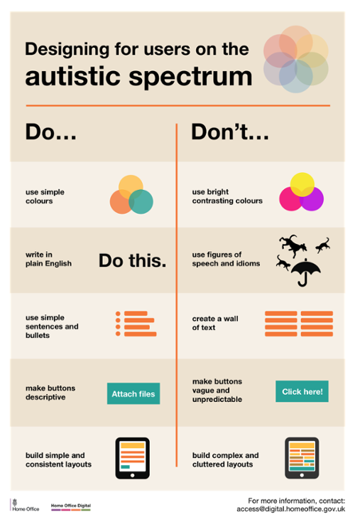
Designing for users on the autistic spectrum
Do:
- use simple colors
- write in plain English
- use simple sentences and bullets
- make buttons descriptive - for example, "Attach files"
- build simple and consistent layouts
Don't:
- use bright contrasting colors
- use figures of speech and idioms
- create a wall of text
- make buttons vague and unpredictable - for example, "Click here"
- build complex and cluttered layouts
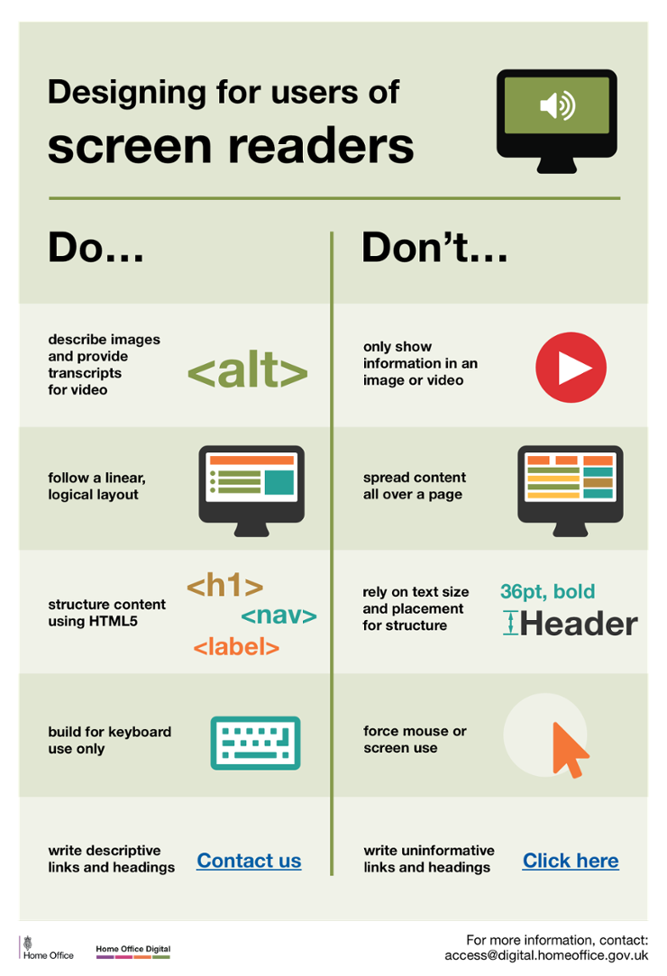
Designing for users of screen readers
Do
- describe images and provide transcripts for video
- follow a linear, logical layout
- structure content using HTML5
- build for keyboard use only
- write descriptive links and heading - for example, "Contact us
Don't
- only show information in an image or video
- spread content all over a page
- rely on text size and placement for structure
- force mouse or screen use
- write uninformative links and heading - for example, "Click here"
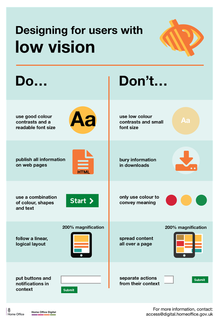
Designing for users with low vision
Do
- use good contrasts and a readable font size
- publish all information on web pages (HTML)
- use a combination of color, shapes and text
- follow a linear, logical layout -and ensure text flows and is visible when text is magnified to 200%
- put buttons and notifications in context
Don't
- use low color contrasts and small font size
- bury information in downloads
- only use color to convey meaning
- spread content all over a page -and force user to scroll horizontally when text is magnified to 200%
- separate actions from their context
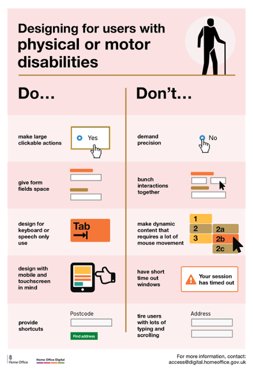
Designing for users with physical or motor disabilities
Do
- make large clickable actions
- give form fields space
- design for keyboard or speech only use
- design with mobile and touch screen in mind
- provide shortcuts
Don't
- demand precision
- bunch interactions together
- make dynamic content that requires a lot of mouse movement
- have short time out windows
- tire users with lots of typing and scrolling
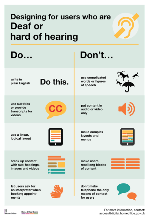
Designing for users who are deaf or hard of hearing
Do
- write in plain English
- use subtitles or provide transcripts for video
- use a linear, logical layout
- break up content with sub-headings, images and videos
- let users ask for their preferred communication support when booking appointments
Don't
- use complicated words or figures of speech
- put content in audio or video only
- make complex layouts and menus
- make users read long blocks of content
- don't make telephone the only means of contact for users
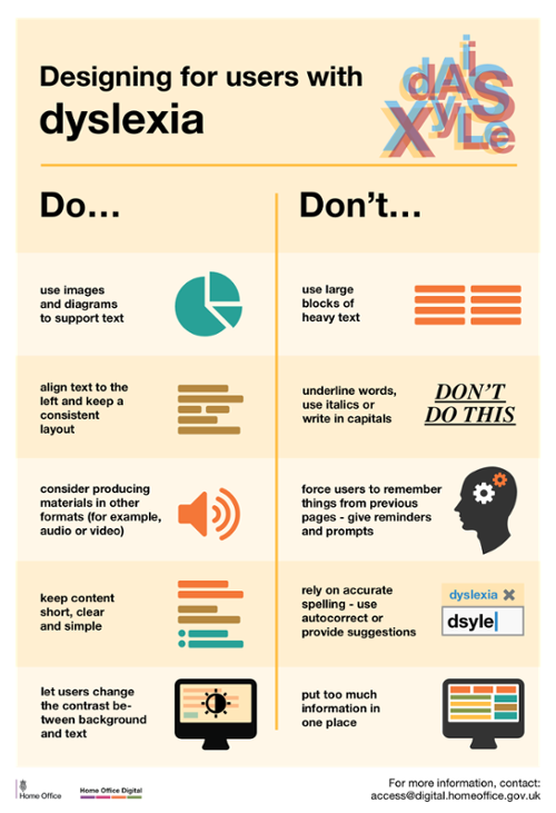
Designing for users with dyslexia
Do
- use images and diagrams to support text
- align text to the left and keep a consistent layout
- consider producing materials in other formats (for example, audio and video)
- keep content short, clear and simple
- let users change the contrast between background and text
Don't
- use large blocks of heavy text
- underline words, use italics or write capitals
- force users to remember things from previous pages - give reminders and prompts
- rely on accurate spelling - use autocorrect or provide suggestions
- put too much information in one place